
The finance industry produces tons of data. They help businesses conduct analyses, recognize trends, increase performance, improve their products and services, set realistic goals, and make informed decisions. However, it's important not only to collect and process information but also to deliver it to readers in a simple and conceivable manner. It’s difficult to get clear takeaways when you look at endless and boring rows and columns of figures. Financial data visualization can help companies to present their data and statistics in a logical and easy-to-understand way.

written by:
Nadezhda Mal

The finance industry produces tons of data. They help businesses conduct analyses, recognize trends, increase performance, improve their products and services, set realistic goals, and make informed decisions. However, it's important not only to collect and process information but also to deliver it to readers in a simple and conceivable manner. It’s difficult to get clear takeaways when you look at endless and boring rows and columns of figures. Financial data visualization can help companies to present their data and statistics in a logical and easy-to-understand way.
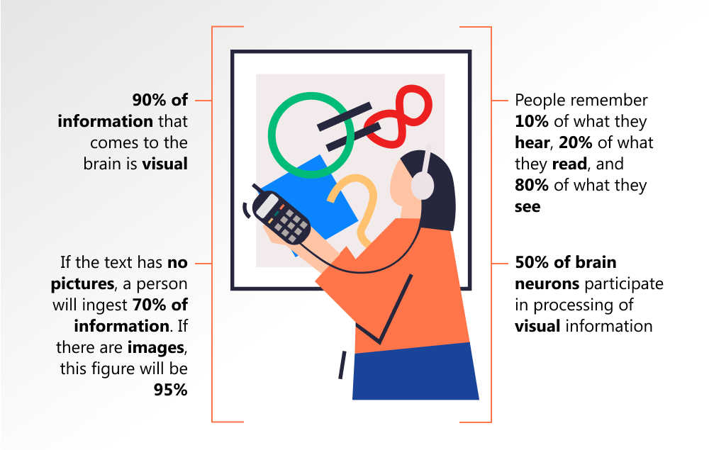
People process images 60k times faster than text. That’s why it’s better to add various pictures, charts, and diagrams to your report. Well, actually, it's data visualization that allows you to make your text easy-to-digest and compelling for your partners, colleagues, and customers. Representing your information in a visual context like maps or graphs will help a reader better understand the significance of your data.
In this article, we will explore the benefits of data visualization in the finance sector and find out which tools are able to add value and help you create powerful and clear reports.
How Can Data Visualization Benefit Your Business?
So, data visualization is the graphic representation of your data that helps you deliver them in the most efficient way possible. People don’t like to read big and ponderous text reports or study huge tables because they require a lot of time and effort to see the point. Time is money, isn’t it? Our brain processes visual content faster, allowing us to understand complex data, get a sense of patterns and relationships, identify trends, assess the situation, and make the right decision.
Data visualization offers the following benefits to the financial sector:
- Faster decision making process. Since people perceive graphic info quicker and better than plain texts, they can just have a look at the data analytics represented in the shape of a chart or a graph and come to the right conclusion. Data visualization allows organizations to receive piles of data on their performance and financial standing. These instruments analyze the data and turn them into charts, diagrams, and other visuals. The graphical representations will help decision-makers see connections between huge sets of data and take productive decisions faster.
- Better understanding of business trends. To be successful, your company should understand market trends. Data visualization tools will enable you to identify relations and patterns. They, in turn, will allow you to easily and quickly discover these trends. It’s crucial to be ahead of your competitors and be the first to notice business trends because everything changes fast, and your company must be able to adapt to these changes as quickly as possible.
- Easy processing of huge sets of data. Using data visualization tools, you will eliminate data silos and transform the relevant materials into charts and graphs. The volumes of data are growing in the financial branch, and their visual representation will allow you to handle them faster, see the whole picture, as well as focus on the necessary part.
- Define hidden patterns and new insights better. When you read a multi-page boring report or scrolling a lengthy table with thousands of figures, you may be bogged down in this information and lose the hidden connections. When you look at the interactive data visualization, you can quickly and easily find the patterns, recognize their glitches, and take steps to resolve them.
- Attract more customers. A clear, bright, and beautiful chart has more chances to retain the attention of readers since most people perceive and remember visual information better.
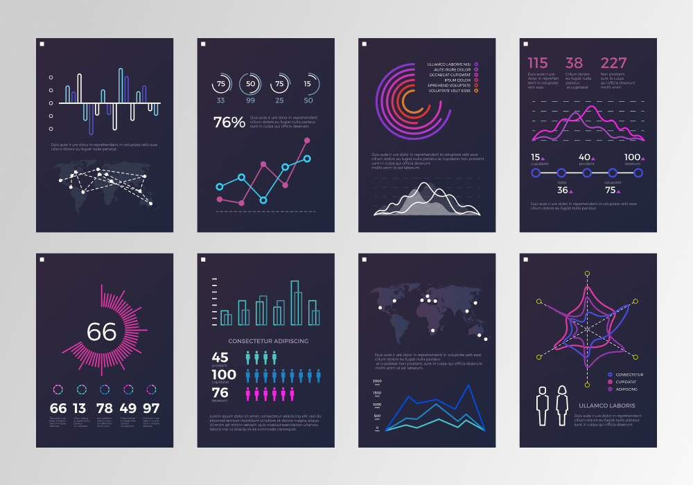
Types of Data Visualization
There are the following general types of data visualization:
- Charts
- Tables
- Graphs
- Maps
- Infographics
- Dashboards
- Diagrams
All of them have one common goal — to allow a user to explore the available data, see the underlying patterns, and tell him/her an impressive story based on the revealed facts. Visualizations allow you to perform accurate analysis and prevent user confusion. Using special data visualization tools, you can build myriad different charts and diagrams to represent your figures and other important info.
What Are Data Visualization Tools?
Data visualization instruments are applications that help you transform raw data into various formats that are easy to understand. You can find a lot of data visualization software in the market today. These services are created to turn statistical data into a visual context, such as charts, infographics, videos, and so on.
Like time, information is money. Data visualization tools will save your money and time that you have to spend on digging through your data in the traditional format. Moreover, you will have an opportunity to improve all aspects of your business by leveraging the data. Researchers have already proved the effectiveness of data visualization for businesses.
Nevertheless, visualizing your data analytics is half the battle. If you want to win and succeed, you should choose the right instrument. Recall that the task of the ideal data visualization tool is to convert your stats into a digestible format. You have valuable info, and your partners and customers should easily read and understand it to make a decision in your favor.

How to Choose the Right Data Visualization Tool?
There are a great number of factors that come into selecting the perfect data visualization tool. It's cool to start by determining the requirements of your company so that you'll be able to compare them with the various capabilities of software available in the market. First of all, you should know how you will use this tool. For this purpose, you should define the goal of visualization and the format of data you want to visualize. The following questions will help you make up your mind:
- What do you need to show: comparison, distribution, composition, or relationship?
- How much detail does your audience need?
- What data do you want to share?
Answering these questions will help you receive the most appropriate data visualization tool. Or, you can use our guide on the best financial data visualization tools in 2022. How have we prepared it? Our team took into account the following criteria:
- Data visualization instruments should be user-friendly and simple-to-use.
- They should have the ability to process multiple sets of data in one visualization.
- They should provide a user with different kinds of visualization, such as images, maps, graphs, dashboards, and so on.
Are you ready? Let's go!
Top 5 Data Visualization Tools for Your Organization
1 Tableau

Tableau is a data visualization software that aids businesses and financial departments in visualizing and understanding their data. The tool allows users to create everything from a simple chart to complex visualizations. Interactive charts and graphs built in the form of worksheets and dashboards help users obtain market visions and insights.
Key features:
- Fast and flexible finance analytics
- Ready-to-go industry solutions
- Connectivity to a wide range of data sources
- Fast installation and implementation
- Outstanding capabilities of data visualization
- User-friendly interface
- Great performance and high scalability
- Quick insights
- High speed and simplicity of testing of various scenarios
- Secure authentication and authorization
2 Zoho Analytics

Zoho Analytics is a powerful data visualization tool that can be used to make insightful dashboards and reports just in several minutes. The instrument helps you analyze any data visually. You can upload your data, create reports, share your materials, and much more. It has an AI-powered assistant, which answers the users' questions in the form of meaningful reports.
Key features:
- Connections with any data sources, such as clouds, online apps, web feeds, and so on.
- Insightful dashboards and reports
- Deep analytics
- Geo visualization
- Drag-and-drop interface
- Strong customer support
3 Sisense

Sisense is a data visualization tool that allows you to receive instant insights that are necessary and useful for your business. You can use this instrument to build visual reports and dashboards, reveal hidden patterns and trends, as well as come to data-driven conclusions.
Key features:
- Very friendly user interface
- Easy upgrades
- Excellent custom support
- Integration with a vast number of platforms and services
- Flexibility and great performance
4 Power BI

Power BI is a data visualization and business intelligence tool developed by Microsoft. It allows businesses to transform their data from different sources into interactive reports and dashboards. The instrument offers users a vast number of software services and connectors. Power BI enables decision-makers to get the required insights and improve the working processes of their organization.
Key features:
- Seamless and secure integration with hundreds of services, platforms, and applications
- Real-time updates
- Easy exploration of huge sets of data
- Advanced analysis using the modeling and predictive capabilities
- No speed and memory constraints
- Simple and safe publishing of reports
- Compatibility with other Microsoft products
5 Adaptive Insights

Adaptive Insights is a data visualization tool that was specifically designed for businesses. It allows users to focus their decision-making on the most important things. The instrument helps you dive into planning, forecasting, budgeting, and modeling to be first in the fast-moving world. Visuals will give you an opportunity to find the root causes and spot trends to solve your business issues and increase your financial, operations, and sales performance.
Key features:
- Connection with any data sources, systems, and frameworks
- Fast and easy planning, forecasting, and budgeting process.
- Shared and modular metrics
- Personalized dashboards
- World-class security
- Non-stop improvement and innovation

Final Thoughts
Humans produce 2.5 quintillion bytes of data every day. Moreover, this figure is expected to grow to 463 exabytes by 2025. It’s a great challenge to handle and interpret them. That’s why we need new and advanced data analysis techniques. Visualization is one of the simplest methods used to analyze and demonstrate data. The right tool is able to help you create a clear story behind your figures.
So, you have learned about one of the best tools for effective visualizations of your stats and other information on your finance, operations, sales, and productivity. These instruments are capable of turning your financial data into a visual, relatable, and tangible format. Being armed with clear and simple reports, you will be able to make an informed, data-driven decision. We live in a highly competitive world where every second counts and decision-making should not take a lot of time. Using data visualization software will help you find valuable information quickly and disregard the noise.
Qulix Systems is ready to render any assistance you may need to choose or apply a data visualization tool that suits your organization. For more details, contact us directly or visit our website.

Contacts
Feel free to get in touch with us! Use this contact form for an ASAP response.
Call us at +44 151 528 8015
E-mail us at request@qulix.com


Feel free to get in touch with us! Use this contact form for an ASAP response.
Call us at +44 151 528 8015
E-mail us at request@qulix.com
![]()
![]()
![]()