
If put in plain language, without using app developers' terminology, how would you describe an app design that is a success? Is it more about an aesthetically appealing product cover or ease-of-use? In other words, what’s more preferable for a user: a beautiful or a highly usable app? Read about Looks vs Usability battle in our recent article.

written by:
Veronica Chizh
![]()

If put in plain language, without using app developers' terminology, how would you describe an app design that is a success? Is it more about an aesthetically appealing product cover or ease-of-use? In other words, what’s more preferable for a user: a beautiful or a highly usable app? Read about Looks vs Usability battle in our recent article.
A group of scientists from the University of Basel, Switzerland, and the University of Copenhagen, Denmark conducted a study in which they tried to find a correlation between higher engagement and aesthetics/usability of a website. They set up four variants of the same online shop, two with high and low aesthetics and two with high and low usability, following established known rules for creating such websites. 80 people participated in an overall evaluation of the sites: starting from the general look to performing specific actions on the site. What scientists found from the respondents’ feedback was that usability has prevalence over aesthetics. To be more precise, aesthetics does not affect perceived usability, but degraded usability negatively affects perceived aesthetics.
Is it really? Not that our designers engaged in mobile app development took it as a personal insult, but we did decide to try and contradict the idea. With this in mind, we picked the hottest hacks from UI/UX community to double check whether usability prevails over aesthetics. Will the beauty save the world this time?
Fight!
Decluttering
The objective behind decluttering is a more minimalistic app design, which has been so in recently. Reduce the number of active buttons to three, and hide others in the drop down menu. The lesser the objects on the page, the more eye-appealing the page.
Wait, don’t we do all the decluttering to minimize the cognitive load for a user? Humans are able to rapidly and accurately enumerate only small sets of objects, about 5 items maximum. The less the better.
A nice start, which brings each team their first point, 1:1.
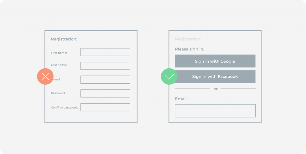
Easy onboarding
Cut your onboarding questionnaire to email plus last name, or better, offer your user login via Facebook/Google account. Long running forms and inquisitive questions may not result in user’s hysterics, however they significantly downgrade the chances for the user to pass the onboarding stage. According to the research by Clutch, a Rating and Research Company, 72 percent of mobile app users will abandon the app if onboarding takes more than 60 seconds.
The lesser the actions taken, the higher the engagement. Usability scores its second point.
Logical grouping
Thus, the screen is clear from any objects which potentially demand too much effort from the users’ brain.
What if a user is supposed to use more than three buttons on a regular basis? As we’ve mentioned earlier, for the aesthetics’ sake, a drop down is added that hides additional options.
However, any drop down should be arranged under common logical principles. Say, it can be very well compared to a cupboard in your kitchen. You’re quite sure where the forks/knifes/spoons lie and surely these lie separately from pans and pots. If you need a barbeque kit, where would you go looking for it?
Sacrificing functional distinction in the name of stylistic minimalism should have its limits. It’s nothing but logical to keep a barbeque kit separate from the utensils, however building a storage closet would require an extra button, which is a stylistic taboo.
Thus, we give an extra point to usability which, at this point, we lack. At the same time, if it wasn’t for a drop down menu, what a mess app screens would make? 3:2.
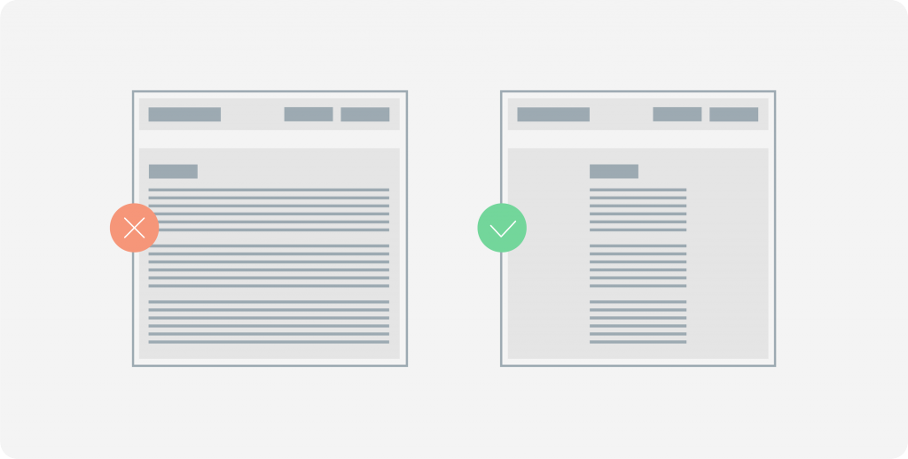
Scrolling
- What do we need?
- Text!
- Where do we need it?
- All over the same page!
Placing all your text on the same page may seem as a good usability solution presenting all that a user may need in a concise manner. The second statement in favor of utilizing maximum space on the page is that “people don’t scroll”.
The latter is what Jakob Nielsen once said and what people believed too eagerly. The truth is, old Mr. Nielsen made this statement in 1996 and already a year later changed his mind in favor of scrolling. As far as the first statement is concerned, the typographic approach to email outweighs it as one line should contain no more than 9 words.
Looks level the match, 3:3.
Shapes and locations
Gestalt principles in design say a lot on how to arrange your website/app well. Proximity, Closure, Common Region, Similarity – the rules are numerous and based on how our brain functions, groups and clusters the elements, and seeks the logic in what it sees.
At the same time, gestalt principles pay equal importance to what our brain perceives as beautiful. For instance, the rule of Symmetry stems from the fact that our brain deems symmetrical objects to be aesthetically pleasing.
The teams go neck to neck, 4:4.
The rules of thumb
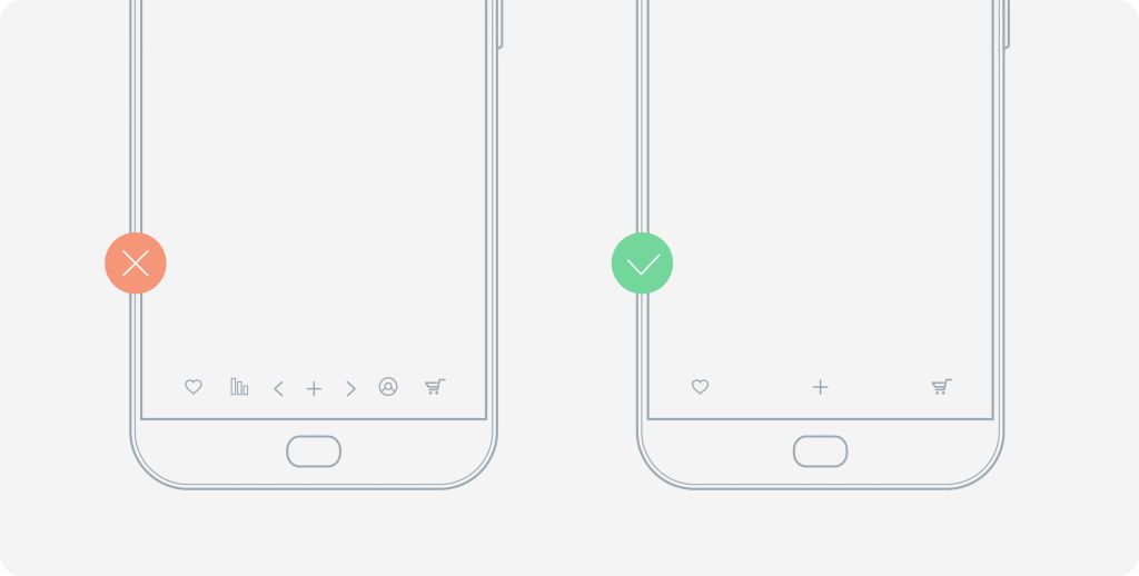
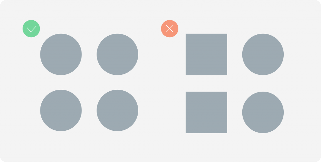
Symmetry and beauty go hand in hand, however those willing to receive a huge thumb up from their app users should also follow the rules of thumb. Instead of playing on user’s hunger for aesthetics, look how far his/her thumb can reach along the screen surface. For example, how far a Call-for-Action button should be from the user’s thumb? Not that we don’t use both hands to navigate through the website/app, but doing it using only a thumb is a way easier, especially on the go.
Study the pictures below to locate your buttons wisely, with due care of usability instead of looks.

In a reversed manner, the same assumption applies to design of the buttons calling for “destructive actions”, e.g. cancel, unsubscribe, delete, etc. Under the rules of symmetry, the OK and CANCEL buttons should be adjacent. Although, what we don’t want the user to do is accidentally or, truth be told, even intentionally push that cursed destructive NO, CANCEL, I DESAGREE, etc. It is nothing but logical to hide them from the user’s thumb.
Usability gains one more point, 5:4.
Amicable agreement
Okay, folks, we’ll stop here. We tried hard to help the looks win. There’s so many usability hacks left to cover, i.e. minimizing user input, gamification, rewarding along with adopting apps for the people with special needs, while we definitely fall short of points in favor of higher app aesthetics. This makes it clear that a beautifully crafted app is the one that is user-friendly, above all, with aesthetics slightly dragging behind.
The scientists from the study above were pretty accurate stating that usability outperforms an aesthetic appeal. That’s why we see so many ugly apps around. Oops, that was pretty harsh. The truth’s in general sounds not so nice more often than not. To make the matters even worse, when confronted with the choice, clients themselves incentivize sacrificing usability – let alone good looks – for the sake of functionality, Denis Liholap, Senior Designer at Qulix Systems, claims. “On the one hand, their choice is pretty justified. A client sees clearly that an app benefits from a feature and suffers without it – at least it’s a measurable metric. On the contrary, to objectively judge whether UI/UX is a success, a client needs research data, analytics and time that is constantly a deficit resource. It’s much more complicated than deciding in favor or against specific app feature”.
At the same time, in the aesthetics vs usability battle Denis prioritizes the latter. “A UI/UX designer is primarily an engineer, while his/her ability to draw aesthetically pleasing rounded rectangles is of secondary importance. UI/UX design is a complex system of components, logically bound and interdependent. Designing an app implies a clear understanding of how it will function when deployed, what are the platform limitations, etc. In theory, any client’s idea is realizable. The point is, whether spending weeks deploying animated features wouldn’t be a waste of time? Is your decision a research-based one or do you simply want animation because it’s amusing?”
Where does the balance lie?
Still, you don’t want your app to scare potential users away as they cast their first glance upon it, do you? To ensure that your app functions well, is a user-friendly and eye-pleasing, dedicate proper efforts to every stage of the app development. What are the right proportions for aesthetics/usability/functionality, what is the recipe for a dream app? See the table below for the approximate resource allocation mobile app developers usually stick to.
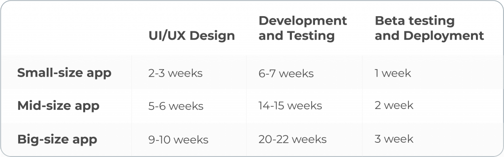
As you can see from the table, UI/UX eats up to one-third of total time reserved for an app development. Should you want to cut it further, say, in favor of a more detailed testing (which is not bad in itself), the resulting product may turn out to be a well-functioning monster. Otherwise, when efforts are mainly invested into aesthetics, with functionality and usability left somewhat unattended, overall impression suffers even more.
What else to say? May your decisions be perfectly balanced when designing an app. So balanced that even Thanos would want to use it.
A bonus fact: In his recent article, Yazim Akkawi, a UI/UX columnist, complains that the most popular apps are starting to look the same. On the bright side, they’re same eye-pleasing. Not same ugly. No-no-no. At least aesthetics has become a default feature for the top players and we hope the trend will spread far beyond.
Need more expertise in App Design? Contact our Support team for more details or visit our website.

Contacts
Feel free to get in touch with us! Use this contact form for an ASAP response.
Call us at +44 151 528 8015
E-mail us at request@qulix.com


Feel free to get in touch with us! Use this contact form for an ASAP response.
Call us at +44 151 528 8015
E-mail us at request@qulix.com
![]()
![]()
![]()